
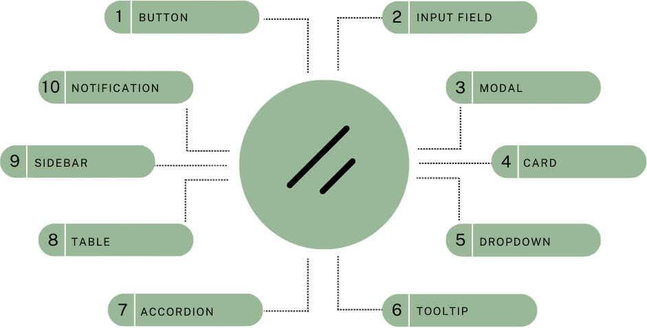
10 Essential Shadcn Components Every Developer Should Know About
 By SW Habitation
Living in the web development world, it may just feel like digging for treasure until you find your tools. If you're just starting now, well, you're in luck because Shadcn is packed full of awesome components that can make life so much easier.
If you are a professional or a beginner, knowing these 10 essential Shadcn components will have you building fantastic web apps a lot quicker and with much less hassle. Let's dive right in!
1. Button Component
First up is the Shadcn Button Component. Consider this one as your go-to for creating stylish and functional buttons with at least effort. Here's a simple example of using it:
1
2
3
4
5
6
7
import { Button } from 'shadcn';

const App = () => (
  <Button color="primary" onClick={() => alert('Button clicked!')}>
    Click Me
  </Button>
);
Adjust the size, style, and state to best fit your design. It's a small element, but it might make a huge difference!
2. Input Field Component
Next up is the Shadcn Input Field Component. Generally, forms are a headache, but this component just makes handling user input a piece of cake. Here's how you could use it with validation:
1
2
3
4
5
6
7
8
9
10
import { Input } from 'shadcn';

const App = () => (
  <Input
    type="text"
    placeholder="Enter your name"
    onChange={(e) => console.log(e.target.value)}
    required
  />
);
Options for validation and input masks ensure that data is captured correctly and with speed.
3. Modal Component
Need to display a popup for alerts, forms, or additional info? The Shadcn Modal Component has got you covered. Here's a basic example:
1
2
3
4
5
6
7
8
9
10
11
12
13
14
15
16
17
import { Modal, Button } from 'shadcn';
import { useState } from 'react';

const App = () => {
  const [isOpen, setIsOpen] = useState(false);

  return (
    <>
      <Button onClick={() => setIsOpen(true)}>Open Modal</Button>
      <Modal isOpen={isOpen} onClose={() => setIsOpen(false)}>
        <h2>Modal Title</h2>
        <p>Some important content goes here.</p>
        <Button onClick={() => setIsOpen(false)}>Close</Button>
      </Modal>
    </>
  );
};
This plugin is flexible and easy to use, turning those modal windows into child's play both in implementing and customizing.
4. Card Component
The Shadcn Card Component is good for displaying content in a neat, attractive manner. Usage of the component is described below.
1
2
3
4
5
6
7
8
9
10
import { Card } from 'shadcn';

const App = () => (
  <Card>
    <img src="https://via.placeholder.com/150" alt="Placeholder" />
    <h3>Card Title</h3>
    <p>Some description about the card content.</p>
    <Button>Read More</Button>
  </Card>
);
Whether displaying images, text, or actions, this component allows the developer to keep the component neat and generally more visually appealing.
5. Dropdown Component
Want to show a dropdown menu? The Shadcn Dropdown Component got your back. Here's a quick example:
1
2
3
4
5
6
7
8
9
import { Dropdown, DropdownItem } from 'shadcn';

const App = () => (
  <Dropdown trigger="Click me">
    <DropdownItem onClick={() => console.log('Item 1 clicked')}>Item 1</DropdownItem>
    <DropdownItem onClick={() => console.log('Item 2 clicked')}>Item 2</DropdownItem>
    <DropdownItem onClick={() => console.log('Item 3 clicked')}>Item 3</DropdownItem>
  </Dropdown>
);
That's super straightforward to make dropdowns and lists that will help you keep your navigation tidy and user-friendly.
6. Tooltip Component
Need to give more information but have no space for it on your page? Why not try the Shadcn Tooltip Component? Take a look:
1
2
3
4
5
6
7
import { Tooltip } from 'shadcn';

const App = () => (
  <Tooltip content="This is a tooltip">
    <Button>Hover me!</Button>
  </Tooltip>
);
Tooltips that appear upon hover or focus of an element provide a nice, unobtrusive method of giving context and increasing usability.
7. Accordion Component
Need to save some space? The Shadcn Accordion Component provides an option to collapse and expand sections of the user's choice. Here's a basic example of how it looks:
1
2
3
4
5
6
7
8
9
10
11
12
import { Accordion, AccordionItem } from 'shadcn';

const App = () => (
  <Accordion>
    <AccordionItem title="Section 1">
      <p>Content for section 1.</p>
    </AccordionItem>
    <AccordionItem title="Section 2">
      <p>Content for section 2.</p>
    </AccordionItem>
  </Accordion>
);
It is ideal for the FAQ or any content that needs to be organized in neat order.
8. Table Component
It is called the Shadcn Table Component, and this is how to use it with sorting. For all your data display needs, use the Shadcn Table Component. Here is how you can use it with sorting: For all your data display needs, use the Shadcn Table Component. Here is how you can use it with sorting:
1
2
3
4
5
6
7
8
9
10
11
12
13
14
15
16
17
18
import { Table, TableHeader, TableBody, TableRow, TableCell } from 'shadcn';

const App = () => (
  <Table>
    <TableHeader>
      <TableRow>
        <TableCell>Header 1</TableCell>
        <TableCell>Header 2</TableCell>
      </TableRow>
    </TableHeader>
    <TableBody>
      <TableRow>
        <TableCell>Data 1</TableCell>
        <TableCell>Data 2</TableCell>
      </TableRow>
    </TableBody>
  </Table>
);
It features sorting, filtering, and pagination to keep your data organized and cleanly presented in an interactive manner.
9. Sidebar Component
Use the Shadcn Sidebar Component to create a sleek responsive sidebar. Here's a simple example of how it might look:
1
2
3
4
5
6
7
8
9
import { Sidebar, SidebarItem } from 'shadcn';

const App = () => (
  <Sidebar>
    <SidebarItem>Home</SidebarItem>
    <SidebarItem>About</SidebarItem>
    <SidebarItem>Contact</SidebarItem>
  </Sidebar>
);
Excellent for the job of organizing navigation and additional content, because it keeps your app easy to navigate and visually weighted.
10. Notification Component
Shadcn Notification Component: Keep your users in the loop with this handy notification component from Shadcn. Here's how to use it:
1
2
3
4
5
6
7
import { Notification } from 'shadcn';

const App = () => (
  <Notification type="info">
    <p>This is an important update!</p>
  </Notification>
);
Whether an alert, a message, or a status update, this component ensures the important info makes its way to your user clearly and effectively.
Conclusion
Knowing these components in Shadcn will definitely give you development horsepower. They are designed to make your life easier and your web apps much better. Take the plunge today and try these components out; see for yourself how they further improve your projects.
Next blog that you can read...
By SW HabitationBy SW HabitationBy SW Habitation