
What is Emotion CSS? A Beginner’s Guide
 By SW Habitation
CSS in JavaScript (CSS-in-JS) has become a popular approach for styling modern web applications, and Emotion css is the one of the best libraries for it. If you’ve heard about Emotion but aren’t sure how it works or why it’s useful, this blog is just for you!
By the end, you’ll understand:
- What Emotion CSS is and why it's popular ?
- How to use Emotion in your project ?
- What is the differences between Styled Components and Emotion ?
- Pros and cons of using Emotion.
What is Emotion CSS?
First of all Emotion css is a library specially designed for writing css in styles with javascript. It provides predictable style composition for great developer experience.
- Website : https://emotion.sh/docs/introduction
- Github : https://www.npmjs.com/package/@emotion/css
It provides two ways to style components:
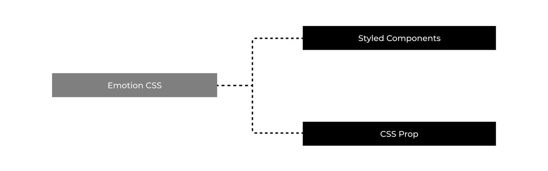
1. Styled Components : Similar to the styled-components library.
2. CSS Prop : A lightweight way to use Emotion without creating separate styled components.
Since styles are written inside JS files, you get dynamic theming, scoped styles, and better maintainability all things while keeping performance higher.
Why Use Emotion?
1. Scoped Styles (No More Global Conflicts!)
What if I say forget about class name conflicts ? Emotion generates unique class names, you don’t have to worry about styles affecting accidental elements.
2. Dynamic Styling with Props
With Emotion css, styles can change based on component props, which makes it easy to create theme aware components.
3. Automatic Vendor Prefixing
No need to manually add browser prefixes like -webkit- or -moz-. Emotion handles it for you.
4. Better Performance Than Traditional CSS
Emotion removes unused styles and only loads what's necessary, making pages load faster.
5. Works with Server-Side Rendering (SSR)
Unlike some CSS-in-JS solutions, Emotion works great with SSR (important for Next.js apps!).
How to Use Emotion CSS ?
There are two packages available, one is @emtion/core and the other one is @emotion/styled, which powers the styled-components.
We will see the second one here,
Install Emotion
Run the following command to install Emotion in your project:
1
npm install @emotion/react @emotion/styledOR if you're using yarn:
1
yarn add @emotion/react @emotion/styledUsing Emotion’s Styled Components API
If you've used Styled Components, Emotion’s styled API will feel familiar.
1
2
3
4
5
6
7
8
9
10
11
12
13
14
15
16
17
18
19
20
/** @jsxImportSource @emotion/react */
import styled from "@emotion/styled";

const Button = styled.button`
  background-color: #0070f3;
  color: white;
  padding: 10px 20px;
  border: none;
  border-radius: 5px;
  cursor: pointer;
  font-size: 16px;

  &:hover {
    background-color: #005bb5;
  }
`;

export default function App() {
  return <Button>Click Me</Button>;
}
The Button component is now fully styled and reusable!
Using the CSS Prop (Alternative Method)
You can also style elements inline using the css prop instead of styled components.
1
2
3
4
5
6
7
8
9
10
11
12
13
14
15
16
17
18
19
20
/** @jsxImportSource @emotion/react */
import { css } from "@emotion/react";

const buttonStyle = css`
  background-color: #0070f3;
  color: white;
  padding: 10px 20px;
  border: none;
  border-radius: 5px;
  cursor: pointer;
  font-size: 16px;

  &:hover {
    background-color: #005bb5;
  }
`;

export default function App() {
  return <button css={buttonStyle}>Click Me</button>;
}
When to Use styled vs. css Prop?
- Use styled when you want reusable components.
- Use css prop when you need one-off styles without creating extra components.
Theming with Emotion
Want to apply global styles and themes? Emotion supports Theme Providers to make styling even more flexible.
1
2
3
4
5
6
7
8
9
10
11
12
13
14
15
16
import { ThemeProvider } from "@emotion/react";

const theme = {
  colors: {
    primary: "#0070f3",
    secondary: "#ff4081",
  },
};

export default function App() {
  return (
    <ThemeProvider theme={theme}>
      <Button>Styled with Emotion!</Button>
    </ThemeProvider>
  );
}
Now, your styled components can access the theme like this:
1
2
3
4
5
6
const Button = styled.button`
  background-color: ${(props) => props.theme.colors.primary};
  color: white;
  padding: 10px 20px;
  border-radius: 5px;
`;
Emotion vs. Styled Components: Which One to Use?
- If you need better performance, the CSS prop, and smaller bundle sizes, Emotion is the better choice.
- If you’re already using Styled Components, Emotion’s styled API feels familiar, so it’s easy to switch.
Pros & Cons of Using Emotion
Pros:
- Scoped styles prevent conflicts.
- Dynamic styling based on props.
- Optimized for performance and SSR.
- No extra setup for vendor prefixes.
- Works with Next.js, React, and TypeScript.
Cons:
- Slightly different syntax if you’re used to traditional CSS.
- Requires additional dependencies.
- Might feel unnecessary for small projects.
Conclusion
As far we have discussed a lot regarding emotion css. Let's summurize in points...
- If you're building a large React or Next.js project, Emotion improves performance and keeps styles organized.
- If you need dynamic styling, better SSR support, or prefer the CSS prop approach, Emotion is a great choice.
- If you're already using Styled Components, Emotion feels familiar but is lighter and faster.
Next blog that you can read...
By SW HabitationBy SW HabitationBy SW Habitation