
Foundation vs. Tailwind CSS
 By SW Habitation
Foundation

Tailwind CSS
You know how building a website can feel like a lot, especially when you’re trying to style every little thing yourself? Buttons, forms, layouts… it adds up fast. That’s where UI frameworks really save the day. They give you a bunch of premade design elements that you can just drop in and go. It’s like having a design starter pack that helps your site look clean and professional, without spending forever tweaking the details.
What is Foundation?
Foundation by Zurb is a responsive front-end framework designed for creating responsive and accessible websites quickly. It is known for its mobile-first approach and powerful grid system, Foundation provides a set of prebuilt components and tools that help developers create professional websites, prototypes, and production-ready apps.
Foundation has been widely used by enterprises and is praised for its accessibility features that makes a solid choice for large-scale projects.
Key Features of Foundation

- Responsive Grid: Flexible 12-column grid with responsive breakpoints.
- UI Components: Includes buttons, forms, sliders, menus, modals, tooltips, and more.
- Accessibility: ARIA support and semantic markup built in.
- Sass Integration: Easy to customize with Sass variables and mixins.
- Motion UI: Built-in animation library for smooth transitions.
- Email Framework: Foundation for Emails to create responsive email templates.
Advantages of Foundation
- Theming : Sass variables, mixins, and functions allow deep but easy customization.
- Consistency : Provides a consistent design system for teams working on large projects.
- Accessibility : Built-in ARIA support and WCAG compliance for inclusive websites.
- Grid System : Responsive, flexible grid with custom breakpoints for any screen size.
- Mobile-First : Designed with a mobile-first approach, ensuring layouts work on small screens first.
- Components : Includes a wide range of prebuilt UI components like buttons, forms, menus, and modals.
- Professional Use : Trusted by enterprises and large projects where stability and accessibility matter.
- Integration : Plays well with modern build tools (Gulp, Webpack, npm) for scalable workflows.
- Responsive Emails : Comes with Foundation for Emails to create mobile-friendly email templates.
Disadvantages of Foundation
- Design Opinionated : Prebuilt components feel dated compared to newer UI frameworks.
- Support : Fewer active tutorials, blog posts, and YouTube guides compared to Bootstrap.
- Learning Curve : More advanced setup and Sass knowledge needed, unlike Bulma or Bootstrap.
- Weight : Bigger in size than minimal CSS frameworks, which can affect performance.
- Popularity : Less adoption in recent years compared to Bootstrap or Tailwind CSS.
- Community : Smaller user base and fewer third-party themes or extensions.
- Complexity : Might be overkill for small projects that don’t need advanced features.
- Documentation : Feels less beginner-friendly and not updated as frequently.
What is Tailwind CSS?
Tailwind CSS is a utility-first CSS framework that allows developers to design user interfaces by applying atomic utility classes directly in markup. Rather than offering prebuilt UI components, it empowers developers with building blocks to create fully customized and performance-optimized designs.
Key features of Tailwind CSS
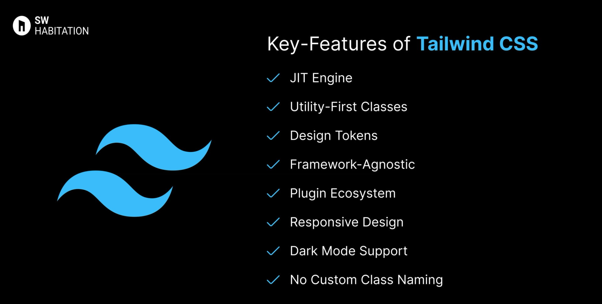
- JIT Engine: Builds only the styles you use, resulting in small and fast CSS bundles.
- Utility-First Classes: Apply styling via single-purpose classes like p-4, text-sm, or bg-red-500.
- Design Tokens: Consistent spacing, sizing, and color scales across your design.
- Framework-Agnostic: Compatible with React, Vue, Svelte, Angular, and plain HTML.
- Plugin Ecosystem: Extend with official and community plugins for forms, typography, etc.
- Responsive Design: Built-in mobile-first breakpoints using prefixes like sm:, md: etc.
- Dark Mode Support: Easily implement dark mode using dark: variants or media strategies.
- No Custom Class Naming: Skip naming headaches now you can directly compose your layout visually with utility classes.
Advantages of Tailwind CSS
- No CSS Context Switching: All styling lives right in the markup — no need to jump between HTML and CSS.
- Framework Independence: Works with any modern frontend stack without restrictions.
- Design Control: Gives developers full control over the UI without being locked into component styling.
- Highly Customizable: Themes, spacing, fonts, and colors can be tailored to any brand or project.
- Consistent Design Language: Utility classes encourage consistency across the app.
- Great Ecosystem: Strong community support, tons of plugins, UI kits, and templates available.
- Performance Optimized: Small CSS bundles with tree-shaking and JIT mean faster load times.
Disadvantages of Tailwind CSS
- Verbose HTML: HTML/JSX can become cluttered with many class names.
- Initial Setup Time: Customizing themes and config files may be overkill for small projects.
- Steep Learning Curve: Takes time to get used to utility classes, especially for those used to traditional CSS.
- No Built-in Components: Unlike Bootstrap or Chakra UI, you need to build components from scratch.
- Harder for Designers: Designers unfamiliar with utility-first might find it harder to collaborate.
Comparison Between Foundation vs Tailwind CSS
Use Cases of Foundation
- Websites needing advanced UI components with JS integration.
- Projects needing responsive emails + websites.
- Large-scale projects with complex layouts.
- Enterprise websites requiring accessibility.
Use Cases of Tailwind CSS
- High-performance marketing pages
- Web apps that need full control over UX and design
- Custom-designed SaaS dashboards
- Design systems with strict branding guidelines
- Mobile-first responsive web apps
Other Resources
Conclusion
UI frameworks make building a polished website way easier. Whether you're working on something simple or a big project, they help you get things looking just right without having to stress over every little design decision. With ready-to-use components, responsive layouts, and modern styles, you can build faster and smarter.
So, pick one that works for you, and start creating a site that looks amazing from the get-go.
Frequently asked questions
What is Foundation CSS?
Foundation is a responsive front-end framework by Zurb, used to build mobile-first, accessible websites.
How is it different from Bootstrap?
Both are popular, but Foundation is more flexible, Sass-driven, and has stronger accessibility features.
Is Foundation mobile-first?
Yes, its grid and components are designed with mobile-first responsiveness.
Can I customize Foundation easily?
Yes, it’s built with Sass, so you can tweak variables, colors, and components.
Does Foundation support accessibility?
Definitely. It includes ARIA support and a11y-friendly components out of the box.
Is Tailwind a CSS framework like Bootstrap?
It's more of a utility-based toolkit. While Bootstrap gives you components, Tailwind gives you building blocks.
Can I use Tailwind with React?
Yes, Tailwind works seamlessly with React, Vue, Svelte, and even plain HTML.
How is Tailwind different from inline styles?
Tailwind uses a design system with responsive variants and consistent scaling — unlike random inline styles.
Does it support dark mode out of the box?
Yes. You can use dark: variants or configure custom strategies.