
Foundation vs. Tachyons
 By SW Habitation
Foundation

Tachyons
You know how building a website can feel like a lot, especially when you’re trying to style every little thing yourself? Buttons, forms, layouts… it adds up fast. That’s where UI frameworks really save the day. They give you a bunch of premade design elements that you can just drop in and go. It’s like having a design starter pack that helps your site look clean and professional, without spending forever tweaking the details.
What is Foundation?
Foundation by Zurb is a responsive front-end framework designed for creating responsive and accessible websites quickly. It is known for its mobile-first approach and powerful grid system, Foundation provides a set of prebuilt components and tools that help developers create professional websites, prototypes, and production-ready apps.
Foundation has been widely used by enterprises and is praised for its accessibility features that makes a solid choice for large-scale projects.
Key Features of Foundation

- Responsive Grid: Flexible 12-column grid with responsive breakpoints.
- UI Components: Includes buttons, forms, sliders, menus, modals, tooltips, and more.
- Accessibility: ARIA support and semantic markup built in.
- Sass Integration: Easy to customize with Sass variables and mixins.
- Motion UI: Built-in animation library for smooth transitions.
- Email Framework: Foundation for Emails to create responsive email templates.
Advantages of Foundation
- Theming : Sass variables, mixins, and functions allow deep but easy customization.
- Consistency : Provides a consistent design system for teams working on large projects.
- Accessibility : Built-in ARIA support and WCAG compliance for inclusive websites.
- Grid System : Responsive, flexible grid with custom breakpoints for any screen size.
- Mobile-First : Designed with a mobile-first approach, ensuring layouts work on small screens first.
- Components : Includes a wide range of prebuilt UI components like buttons, forms, menus, and modals.
- Professional Use : Trusted by enterprises and large projects where stability and accessibility matter.
- Integration : Plays well with modern build tools (Gulp, Webpack, npm) for scalable workflows.
- Responsive Emails : Comes with Foundation for Emails to create mobile-friendly email templates.
Disadvantages of Foundation
- Design Opinionated : Prebuilt components feel dated compared to newer UI frameworks.
- Support : Fewer active tutorials, blog posts, and YouTube guides compared to Bootstrap.
- Learning Curve : More advanced setup and Sass knowledge needed, unlike Bulma or Bootstrap.
- Weight : Bigger in size than minimal CSS frameworks, which can affect performance.
- Popularity : Less adoption in recent years compared to Bootstrap or Tailwind CSS.
- Community : Smaller user base and fewer third-party themes or extensions.
- Complexity : Might be overkill for small projects that don’t need advanced features.
- Documentation : Feels less beginner-friendly and not updated as frequently.
What isTachyons?
Tachyons is a functional/atomic CSS framework that uses small, reusable utility classes. Instead of big UI components or deeply nested CSS, Tachyons encourages developers to style elements using many tiny, single-purpose classes.
Let's check by the example,
1
2
3
<button class="f6 link dim br3 ph3 pv2 mb2 dib white bg-dark-blue">
Click Me!
</button>
Here, each class f6, br3, ph3 controls a specific CSS property like font size, border radius, padding, etc. This modular approach makes styling predictable and reusable.
Tachyons was one of the innovator of the utility-first CSS movement—it influenced modern frameworks like Tailwind.
Key Features of Tachyons
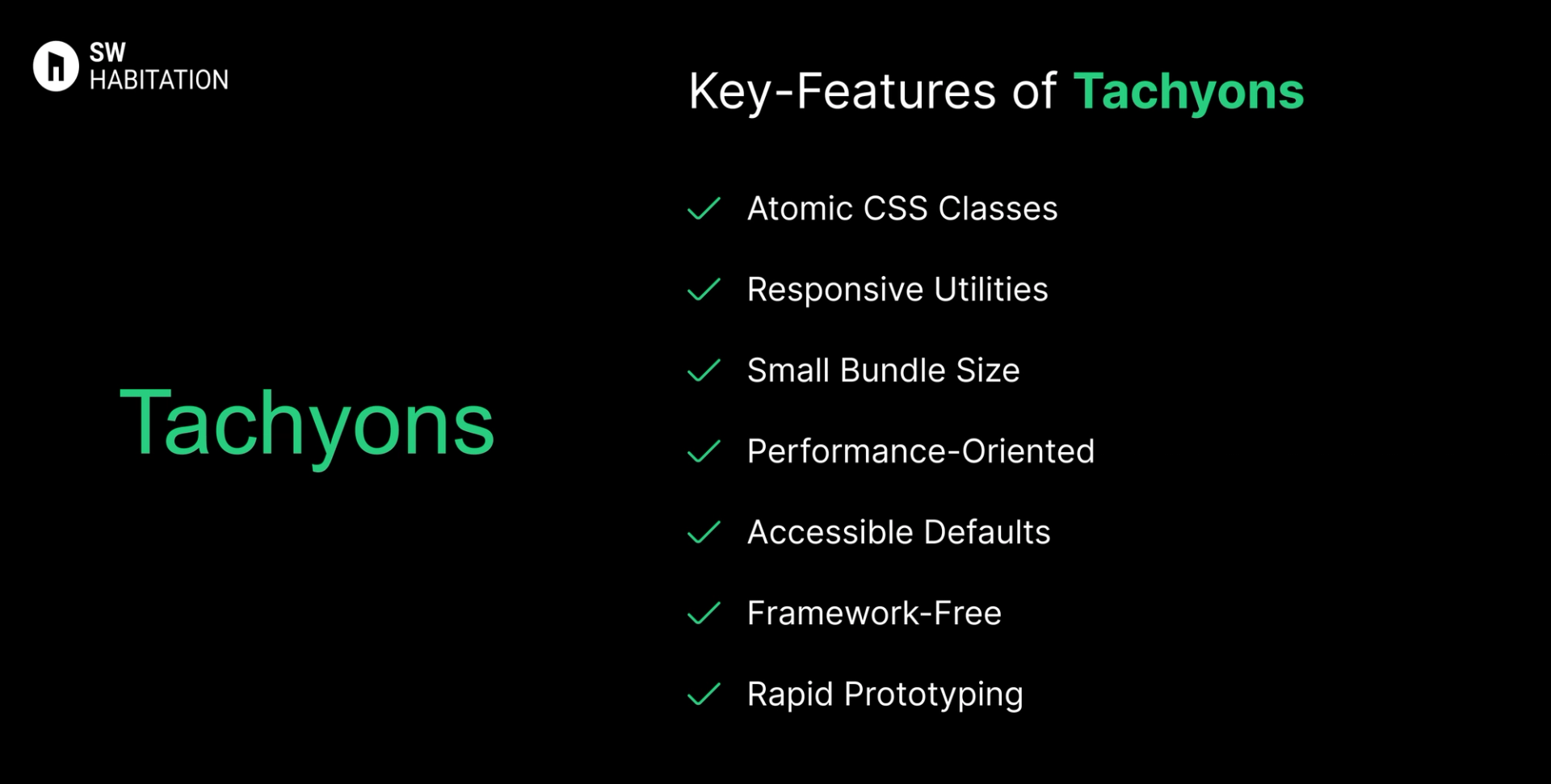
- Atomic CSS Classes: Every class does one thing (e.g., pa3 = padding).
- Responsive Utilities: Classes adapt to multiple screen sizes.
- Small Bundle Size: Around 14KB minified & gzipped.
- Performance-Oriented: Encourages minimal CSS output.
- Accessible Defaults: Typography and spacing built for readability.
- Framework-Free: Works with plain HTML, React, Vue, or any frontend.
- Rapid Prototyping: Compose UIs quickly with utility classes.
Advantages of Tachyons
- Stable: Mature and widely battle-tested since 2015.
- Highly Composable: Mix classes freely to achieve complex designs.
- Consistent: Predictable, reusable naming system.
- Fast & Lightweight: Tiny CSS footprint.
- Great for Prototypes: Quickly test ideas without writing custom CSS.
- Utility-First Approach: No deep CSS overrides needed.
Disadvantages of Tachyons
- Smaller Community: Fewer themes, templates, and ecosystem resources.
- Messy HTML: Can lead to class-heavy markup that’s harder to read.
- No Components: You must build everything (buttons, navbars, modals) manually.
- Learning Curve: Class names (pa3, f5) are shorthand and non-intuitive for beginners.
- Not Actively Maintained: Less frequent updates compared to newer frameworks.
Comparison Between Foundation vs Tachyons
Use Cases of Foundation
- Websites needing advanced UI components with JS integration.
- Projects needing responsive emails + websites.
- Large-scale projects with complex layouts.
- Enterprise websites requiring accessibility.
Use Cases of Tachyons
- Rapid prototyping and MVPs.
- Building custom UIs without depending on pre-styled components.
- Designers who want total control over design instead of prebuilt themes.
- Developers who like atomic/functional CSS.
- Lightweight projects where performance is critical.
Other Resources
Conclusion
UI frameworks make building a polished website way easier. Whether you're working on something simple or a big project, they help you get things looking just right without having to stress over every little design decision. With ready-to-use components, responsive layouts, and modern styles, you can build faster and smarter.
So, pick one that works for you, and start creating a site that looks amazing from the get-go.
Frequently asked questions
What is Foundation CSS?
Foundation is a responsive front-end framework by Zurb, used to build mobile-first, accessible websites.
How is it different from Bootstrap?
Both are popular, but Foundation is more flexible, Sass-driven, and has stronger accessibility features.
Is Foundation mobile-first?
Yes, its grid and components are designed with mobile-first responsiveness.
Can I customize Foundation easily?
Yes, it’s built with Sass, so you can tweak variables, colors, and components.
Does Foundation support accessibility?
Definitely. It includes ARIA support and a11y-friendly components out of the box.
How do I start using Tachyons?
Include via CDN, install with npm, or build a custom version with PostCSS.
What makes Tachyons different?
Tachyons is utility-first and functional using small, single-purpose classes combined directly in HTML.
How big is Tachyons?
Very lightweight, under 14 KB gzipped, and you can slim it down further by removing unused modules.
Can I customize Tachyons?
Yes, through custom builds, CSS variables, or tools like Components AI for theming.
Is Tachyons enough for UI development?
Yes, many developers build full, responsive, and accessible UIs using only Tachyons plus basic CSS knowledge.