
Chakra UI vs. Shadcn UI
 By SW Habitation
Chakra UI

Shadcn UI
You know how building a website can feel like a lot, especially when you’re trying to style every little thing yourself? Buttons, forms, layouts… it adds up fast. That’s where UI frameworks really save the day. They give you a bunch of premade design elements that you can just drop in and go. It’s like having a design starter pack that helps your site look clean and professional, without spending forever tweaking the details.
What is Chakra UI ?
Chakra UI is a popular React component library that lets you build accessible, responsive UIs with ease. It provides a collection of components with built-in ARIA attributes, theme support, and responsive design via style props.
It’s ideal for devs who want plug-and-play components with built-in styling and dark mode.
Key Features of Chakra UI
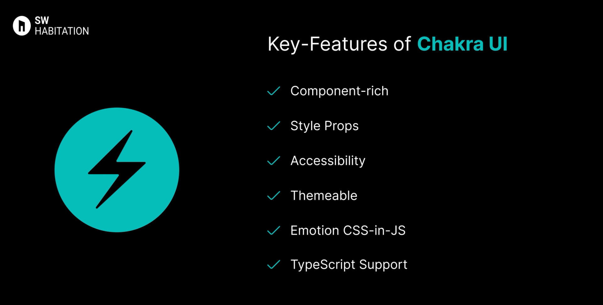
- Component-rich: Inputs, modals, alerts, menus, tooltips, accordions, etc.
- Style Props: Apply margin, padding, color, size directly via props.
- Accessibility: ARIA-compliant components out of the box.
- Themeable: Custom themes, variants, dark mode support.
- Emotion CSS-in-JS: Built with Emotion for dynamic styling.
- TypeScript Support: Fully typed and developer-friendly.
Advantages of Chakra UI
- Easy to use with minimal setup.
- Style props eliminate the need for external CSS.
- Great documentation and community support.
- Built-in dark mode and responsive utilities.
- Clean and maintainable code structure.
Disadvantages of Chakra UI
- Limited design flexibility if you want pixel-perfect UI.
- Larger bundle size due to style props and runtime styling.
- Less control over raw DOM/styling.
- Not Tailwind-friendly out of the box.
- Can be verbose for deeply nested component trees.
What is Shadcn UI?
Shadcn UI is a beautiful and modern component library built on top of Radix UI, styled with Tailwind CSS, and intended for Next.js projects. It offers accessible, production-ready components with theming, variants, and built-in dark mode support.
You install components via CLI and get full control over the code.
Key Features of Shadcn UI
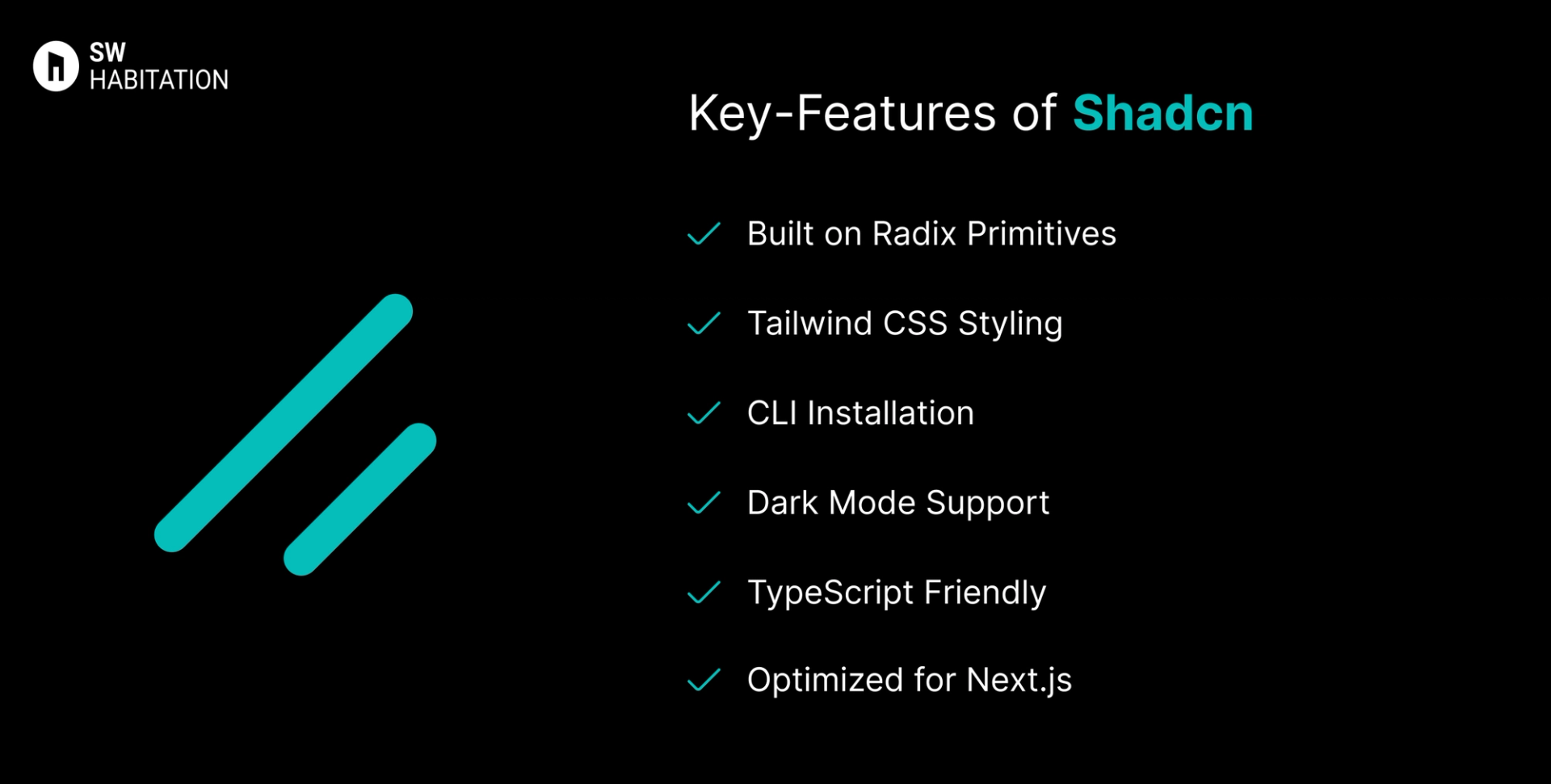
- Built on Radix Primitives: Accessibility and flexibility included.
- Tailwind CSS Styling: Easy customisation with utility-first approach.
- CLI Installation: Add only the components you need.
- Dark Mode Support: Pre-configured light and dark theme switching.
- TypeScript Friendly: Built entirely with TypeScript.
- Optimised for Next.js: Uses App Router structure and conventions.
Advantages of Shadcn UI
- Pre-styled and fast to use, ideal for building modern apps quickly.
- Easily theme-able using Tailwind and variants.
- Components are accessible by default.
- Ideal for SaaS apps, dashboards, and websites.
- Each component is editable because you own the code.
Disadvantages of Shadcn UI
- Requires Tailwind CSS, less suitable if you're not using Tailwind.
- Not suitable for other frameworks like Vue or Angular.
- Depends on Radix primitives, understanding Radix helps.
- Bundle size can grow if you install too many components.
- You need to manage components in your codebase manually.
Comparison Between Chakra UI vs Shadcn UI
Use Cases of Chakra UI
- MVPs, SaaS apps, portfolios that need speed + simplicity
- Devs who prefer using props for styling
- Teams focused on accessibility and fast prototyping
- Apps where the design doesn’t need to be pixel-perfect
- Projects using Emotion or CSS-in-JS ecosystem
Use Cases of Shadcn UI
- Fast development for SaaS products and dashboards
- Admin panels, marketing websites, and eCommerce platforms
- React/Next.js projects with Tailwind CSS setup
- Projects requiring built-in light/dark theming
- Startups and devs who want pre-built UI with flexibility
Other Resources
Conclusion
UI frameworks make building a polished website way easier. Whether you're working on something simple or a big project, they help you get things looking just right without having to stress over every little design decision. With ready-to-use components, responsive layouts, and modern styles, you can build faster and smarter.
So, pick one that works for you, and start creating a site that looks amazing from the get-go.
Frequently asked questions
Is Chakra UI good for accessibility?
Yes! Chakra UI is designed with accessibility (a11y) in mind, following WAI-ARIA standards.
Does Chakra UI support dark mode?
Yes, it has built-in dark mode toggling using the ColorModeProvider.
What styling method does Chakra UI use?
Chakra uses Emotion (a CSS-in-JS library) and style props for inline styling.
Can I create custom themes in Chakra UI?
Definitely. Chakra has a powerful theming system that supports tokens, variants, and full overrides.
Is Chakra UI production-ready?
Yes. It’s widely used in SaaS apps and has a strong developer community.
What is Shadcn UI?
It’s a modern UI library built using Radix UI components, styled with Tailwind CSS, and ready for React apps.
Is Shadcn UI customizable?
Yes, heavily! It uses Tailwind for full styling control and supports variants.
Does Shadcn UI support dark mode?
Yes, via Tailwind’s dark mode and included config setup.
Is Shadcn UI production-ready?
Absolutely. It’s ideal for building sleek, modern, accessible UIs with minimal setup.
Does Shadcn UI work with other frameworks like Vue?
No, it’s built for React (especially Next.js) and not compatible with Vue or Angular.