
Bootstrap vs. Foundation
 By SW Habitation
Bootstrap

Foundation
You know how building a website can feel like a lot, especially when you’re trying to style every little thing yourself? Buttons, forms, layouts… it adds up fast. That’s where UI frameworks really save the day. They give you a bunch of premade design elements that you can just drop in and go. It’s like having a design starter pack that helps your site look clean and professional, without spending forever tweaking the details.
What is Bootstrap ?
Bootstrap is the most popular CSS Framework for developing responsive and mobile-first websites. Do you know it was originally developed by Twitter now X and is now maintained by a large community of developers. Bootstrap provides a collection of pre-designed HTML, CSS, and JavaScript components that can be used to build websites quickly and easily.
Key Features of Bootstrap
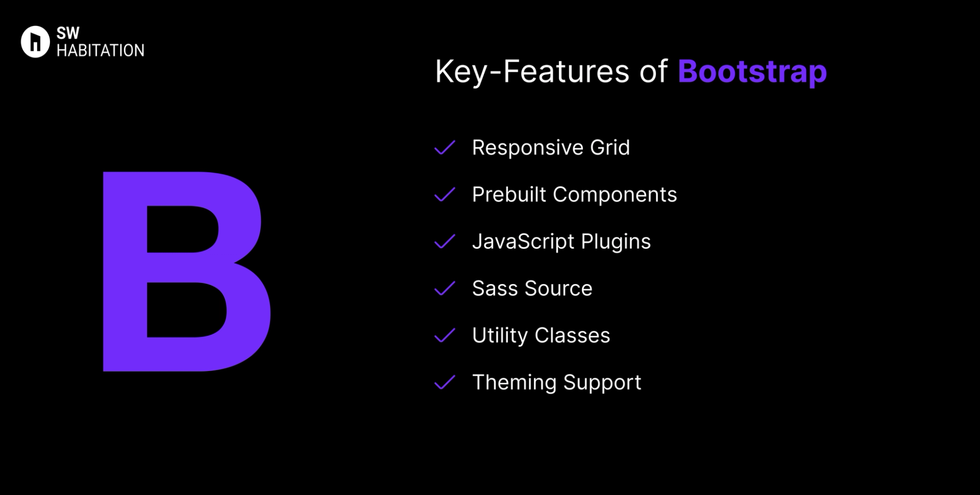
- Responsive Grid: 12-column Flexbox grid with multiple breakpoints.
- Prebuilt Components: Includes modals, tooltips, carousels, navbars, etc.
- JavaScript Plugins: Native JS components — no jQuery dependency now.
- Sass Source: Source code in Sass for easy customization.
- Utility Classes: Tons of helper classes for spacing, colors, displays.
- Theming Support: Customizable via Sass variables.
Advantages of Bootstrap
- Fast Setup: Quickly spin up pages with minimal styling needed.
- Consistency Across Browsers: Ensures uniform UI elements.
- Large Ecosystem: Thousands of themes, templates, starters available
- Modular: Easily import only needed components via Sass.
- Strong Community: Longstanding support and wide adoption.
Disadvantages of Bootstrap
- Learning Curve: Advanced customization requires more expertise
- Overuse of Classes: Cluttered HTML, harder to maintain.
- Heavy File Size: Includes unnecessary CSS/JS, increasing load times.
- Limited Customization: Hard to deeply customize without overriding defaults.
- Uniform Design: Sites can look similar unless customized heavily.
What is Foundation?
Foundation by Zurb is a responsive front-end framework designed for creating responsive and accessible websites quickly. It is known for its mobile-first approach and powerful grid system, Foundation provides a set of prebuilt components and tools that help developers create professional websites, prototypes, and production-ready apps.
Foundation has been widely used by enterprises and is praised for its accessibility features that makes a solid choice for large-scale projects.
Key Features of Foundation

- Responsive Grid: Flexible 12-column grid with responsive breakpoints.
- UI Components: Includes buttons, forms, sliders, menus, modals, tooltips, and more.
- Accessibility: ARIA support and semantic markup built in.
- Sass Integration: Easy to customize with Sass variables and mixins.
- Motion UI: Built-in animation library for smooth transitions.
- Email Framework: Foundation for Emails to create responsive email templates.
Advantages of Foundation
- Theming : Sass variables, mixins, and functions allow deep but easy customization.
- Consistency : Provides a consistent design system for teams working on large projects.
- Accessibility : Built-in ARIA support and WCAG compliance for inclusive websites.
- Grid System : Responsive, flexible grid with custom breakpoints for any screen size.
- Mobile-First : Designed with a mobile-first approach, ensuring layouts work on small screens first.
- Components : Includes a wide range of prebuilt UI components like buttons, forms, menus, and modals.
- Professional Use : Trusted by enterprises and large projects where stability and accessibility matter.
- Integration : Plays well with modern build tools (Gulp, Webpack, npm) for scalable workflows.
- Responsive Emails : Comes with Foundation for Emails to create mobile-friendly email templates.
Disadvantages of Foundation
- Design Opinionated : Prebuilt components feel dated compared to newer UI frameworks.
- Support : Fewer active tutorials, blog posts, and YouTube guides compared to Bootstrap.
- Learning Curve : More advanced setup and Sass knowledge needed, unlike Bulma or Bootstrap.
- Weight : Bigger in size than minimal CSS frameworks, which can affect performance.
- Popularity : Less adoption in recent years compared to Bootstrap or Tailwind CSS.
- Community : Smaller user base and fewer third-party themes or extensions.
- Complexity : Might be overkill for small projects that don’t need advanced features.
- Documentation : Feels less beginner-friendly and not updated as frequently.
Comparison Between Bootstrap vs Foundation
Use Cases of Bootstrap
- Projects where consistency outweighs custom design
- Legacy apps or CMS integration
- Quick MVPs and prototypes
- Dashboard templates, admin panels
Use Cases of Foundation
- Websites needing advanced UI components with JS integration.
- Projects needing responsive emails + websites.
- Large-scale projects with complex layouts.
- Enterprise websites requiring accessibility.
Other Resources
Conclusion
UI frameworks make building a polished website way easier. Whether you're working on something simple or a big project, they help you get things looking just right without having to stress over every little design decision. With ready-to-use components, responsive layouts, and modern styles, you can build faster and smarter.
So, pick one that works for you, and start creating a site that looks amazing from the get-go.
Frequently asked questions
Can I use Bootstrap without JavaScript libraries?
Yes, Bootstrap 5 bundles native JS components and doesn’t require jQuery.
Is Bootstrap responsive?
Yes, built mobile-first using its Flexbox grid and responsive utilities.
Do I need to know HTML, CSS, and JavaScript to use Bootstrap?
Basic knowledge of HTML and CSS is enough to get started. However, knowing JavaScript helps if you want to customize components or use advanced features.
How does Bootstrap help with mobile responsiveness?
Bootstrap uses a grid system and media queries to make websites automatically adjust to different screen sizes, ensuring good user experience across devices.
What is Foundation CSS?
Foundation is a responsive front-end framework by Zurb, used to build mobile-first, accessible websites.
How is it different from Bootstrap?
Both are popular, but Foundation is more flexible, Sass-driven, and has stronger accessibility features.
Is Foundation mobile-first?
Yes, its grid and components are designed with mobile-first responsiveness.
Can I customize Foundation easily?
Yes, it’s built with Sass, so you can tweak variables, colors, and components.
Does Foundation support accessibility?
Definitely. It includes ARIA support and a11y-friendly components out of the box.